Where story meets style
Read The Journal
I'm here to tell your story...the joy, the laughs, the tears, and the memories along the way.


The
VIEW OUR TRAVEL PHOTO ALBUM >
August 15, 2025
BRADEN + BLYTHE | BROADVIEW WEDDING PHOTOGRAPHER


Prairie Wedding Celebration Near Broadview
Some wedding days feel like they’re plucked right out of a love story…Braden and Blythe’s was one of them. With their hearts set on a celebration that was relaxed yet full of meaning, they built a day that reflected who they are: warm, genuine and completely at home in one another’s arms.
Before the excitement of the ceremony began, these two opted for a romantic first look in the quiet beauty of their own backyard. Tucked away from the bustle, with only the sound of the wind and birdsong around them, they exchanged private vows…just the two of them…a tender moment to soak in the depth of their commitment. It was one of those times you can feel in your bones and I felt honoured to witness it.
Blythe added her own touches to her wedding gown, sewing in lace sleeves and delicate details that made it entirely her own. She carried herself with a refined grace, her subtle, serious expression holding so much quiet joy. Her bridesmaids, in warm terracotta and salmon dresses, surrounded her with beauty and laughter as we wandered to some of the most picturesque prairie backdrops…vast prairie fields, wooded trails and a row of weathered bales that seemed made for portraits.
Their ceremony took place in a coulee near their home, with a vine-draped arch dotted with the sweetest orange flowers framing the view. Friends and family gathered in abundance, the coulee alive with love and anticipation.
After “I do,” the couple didn’t want the day to disappear into a whirlwind of schedules…instead, they moved right into celebrating with their guests. The reception, held at Braden’s family farm north of Broadview, was a cozy, joy-filled evening where everyone felt like they belonged. Overcast prairie skies cast the most perfect soft light over the celebration, wrapping the day in a moody, romantic glow.
I’ve photographed Braden, Blythe and little Elyse, their one-year-old daughter, before…back when she was a newborn. Seeing her there, part of their wedding day, felt like the sweetest full-circle moment.
Braden and Blythe, you are perfect for each other. Thank you for inviting me into your story once again. Congratulations, Mr. & Mrs. Richter!


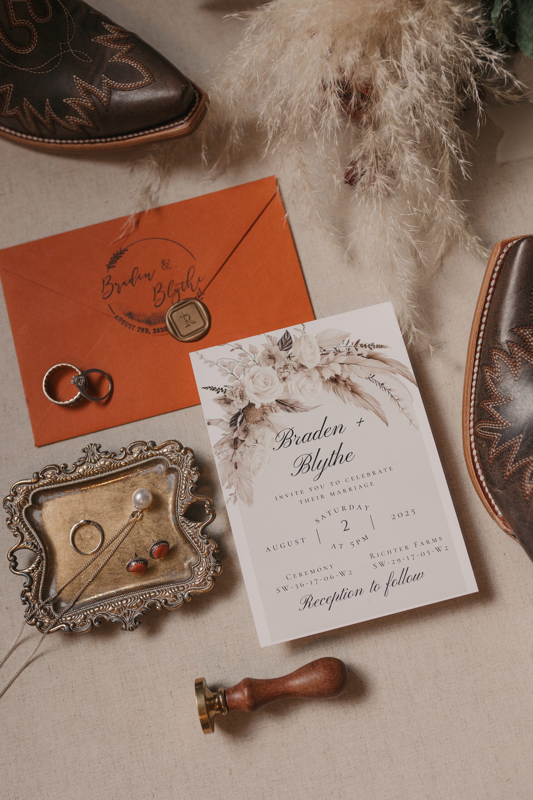


DJ | Longhorn Music, HAIR | Mane Character by Roma, MAKEUP | Martina Tibble, GOWN | Bridal Boutique, BRIDESMAIDS | Azazie, SUITS | Moores

3934

As I explored various craft exchange platforms online, I checked see pebble creek artisan exchange hub – I will order again next month and hope they restock because the products looked unique and useful.
During staging reviews of ecommerce marketplace systems and UI prototype frameworks, analysts encountered a central block featuring harbor vendor plum room console entry node within layout structure, and despite the fruity plum aesthetic, the vendor room is completely empty which reduces usability and engagement during testing sessions
coworking space rental coworking space dubai
For those who enjoy discovering unique handmade products online, there are several platforms that stand out, especially when encountering creative goods gallery that features curated selections of artisan-made items and the browsing experience feels smooth while users explore different handcrafted inspirations and design styles. – A welcoming artisan marketplace that blends creativity, variety, and an engaging discovery journey for shoppers seeking originality.
While reviewing different vendor based platforms I found within the main content area a section containing royal crown cove trade room and even though the branding feels luxurious and well structured, the blurry product images reduce clarity and make it difficult to properly understand what is being offered on the site.
During staging reviews of ecommerce marketplace systems and UI prototype frameworks, analysts encountered a central block featuring harbor vendor stone staging hall entry console within layout structure, and despite the solid stone harbor concept, the vendor hall is still under construction which impacts completeness and user flow during usability testing sessions
As I explored various artisan outlet platforms online, I checked see vale cove artisan browsing hub – The site is useful for discovery, and I quickly found several interesting options while moving through its clean layout.
As I explored artisan marts with soft and elegant presentation styles, I checked see rose trail collection mart – The layout feels peaceful and organized, and browsing is smooth with clearly arranged and appealing product visuals.
The platform has been structured to minimize unnecessary complexity while still offering robust features for advanced users who need them Vendor Room Quick Guide Label Interface this allows both beginners and experienced users to benefit from the same environment without compromise.
While going through various niche commerce directories and curated storefront listings, I found something that appeared neat but not fully transparent, especially where Violet cove commerce atelier link appeared – The design is clean, but no About page makes it feel somewhat unreliable.
While browsing different online trade hubs and marketplace pages, I noticed a platform containing Juniper market harbor hall portal link – It has potential and looks interesting, so I’ll likely revisit it after some time to see updates or changes.
During a general exploration of curated online directories and resource hubs, I found something that seemed responsive and well structured, particularly references including Harbor flora access portal – The site loads fine overall, and my visit felt smooth and pleasant, allowing easy movement through different pages without issues.
Online users seeking comprehensive trading platforms often prefer systems that offer wide product variety combined with smooth navigation and reliable performance across multiple commerce categories in digital environments solarbrook trading plaza which acts as a trading plaza providing users with a centralized location for exploring diverse products and services. – A comprehensive trading plaza built for convenience and efficient digital commerce.
While reviewing sandbox ecommerce systems and UI marketplace frameworks, testers found a central module featuring quartz meadow hall vendor showcase console node integrated into structured layout, and despite the crystal inspired theme, the market hall contains no listings today which reduces perceived completeness during usability testing and evaluation cycles
Завод Металл-Сервис https://zavodmc.ru надежный производитель металлоконструкций в Новосибирске. Индивидуальные проекты, выгодные цены и оперативные сроки.
Premade Cover Art Album https://coverartplace.com marketplace offering professional Design Artwork, Cover Art, and Cover Track visuals created by independent graphic designers. Ideal for artists who need high-quality, ready-made covers for Spotify, Apple Music, and other streaming platforms.
Across prototype marketplace systems and UI sandbox environments, analysts encountered embedded navigation blocks containing cove zen vendor goods room staging portal within page layout, and although the zen cove theme feels balanced and serene, the goods room contains no products which impacts usability during testing sessions
During research into structured artisan emporium websites, I explored explore solar orchard marketplace emporium – Great for gift shopping, everything arrived in one piece and was securely packed.
While exploring vendor marketplace systems I discovered a central content block showing crown harbor trade vendor hall hub and although the branding looks polished and professional, the lack of actual vendor details and reliance on placeholder text makes the platform seem non functional for real browsing.
While navigating through different recommendation threads and curated suggestions, I came across something that looked quite straightforward, particularly with mentions including this reliable source – everything seems to work seamlessly, so I’ll likely revisit it for a deeper review.
While browsing through various online gallery marketplaces and trading directories, I noticed something that felt visually structured but thematically off, especially when seeing Violet harbor trading showcase gallery included – The harbor name appears again, but the gallery contains zero art, which makes the naming feel misleading.
During a comparison of modern commerce hub platforms and their informational clarity, I came across discover upland canyon market hub – The experience seems decent, and the content is useful and easy to understand without unnecessary complexity.
ferncovevault – Vault style neat, content feels organized and carefully structured overall
Shoppers exploring e commerce platforms often prefer systems that simplify choices, and while navigating they might discover sunbrook shopping network where product categories are clearly structured for improved usability. – A connected shopping environment designed to support smooth and intuitive online purchasing.
During a late-night browse of ecommerce platforms I encountered this shop Kettle Crest discount hall and the prices are so low that it raises immediate questions about product sourcing and overall trustworthiness.
During a casual browsing session across online marketplace hubs and resource pages, I found something that seemed easy to navigate and visually clean, particularly references like Harbor Hazel vendor access page – Clean design and good structure make browsing feel comfortable and simple, improving overall usability significantly.
Visitors describe the platform as well-structured and easy to navigate, especially when accessing Cloud Cove Retail View Hub which enhances usability – the goods area is designed to keep browsing straightforward and visually balanced for improved clarity
Across prototype ecommerce environments and UI vendor frameworks, developers identified embedded navigation content containing quartz vendor orchard hall showcase entry node within page structure, and although the branding feels original and mineral inspired like quartz infused orchards, the vendor hall link unexpectedly redirects to the homepage which negatively impacts usability during system analysis and testing cycles
During usability testing of ecommerce vendor marketplace systems and UI prototypes, reviewers noticed a central module containing harbor trail vendor parlor access node embedded within layout flow, and although the trail inspired concept feels well designed and thematically consistent, nearly all navigation links are broken which severely impacts usability during browsing and interaction testing sessions across multiple environments
During a casual review of niche commerce platforms and online storefront listings, I noticed something that looked well organized but slightly underdeveloped in visual identity, particularly Brook walnut foundry vendor link – The walnut concept is strong, but using walnut wood tones in the header would significantly enhance the overall visual harmony and warmth of the design.
пиар в СМИ эффективность публикаций в СМИ
Последние изменения: https://forum.i.ua/topic/27772
автоматические рулонные шторы на створку rulonnye-zhalyuzi-avtomaticheskie.ru .
рулонные шторы купить москва недорого elektricheskie-rulonnye-shtory90.ru .
рольшторы заказать elektricheskie-rulonnye-shtory.ru .
While reviewing experimental online retail pages and abstract ecommerce templates, users often mention segments in Crystal Cove shop overview link – the layout provides clear navigation and structure, yet the lack of actual product content leaves the overview feeling incomplete and open to interpretation
As I reviewed structured retail marketplace districts, I noticed check upland cove commerce zone – The layout is simple and clean, and it is comfortable to browse through different sections without confusion.
Все подробности по ссылке: https://bittogether.com/index.php/topic,24351.0.html
As I analyzed several craft marketplace platforms for usability and product variety, I found check upland harbor artisan marketplace – The navigation could improve, but the products are unique and cool, which makes the site interesting to explore.
During a comparison of artisan-themed online outlets, I found explore golden curated shop – The overall design feels artistic and structured, and browsing across products is easy and visually satisfying.
Online shoppers exploring stylish e commerce platforms frequently seek smooth navigation and appealing visuals, and during such exploration they might come across suncove boutique commerce space showcasing various products and – it provides a user centered design that enhances both browsing comfort and shopping efficiency.
Across prototype marketplace environments and UI vendor frameworks, developers identified embedded navigation content containing vale vendor harbor parlor showcase entry node within page structure, and although the design feels oceanic and soft like a harbor town, the parlor section is completely lifeless and empty which creates a ghost town impression during usability testing and system review cycles
While navigating through a variety of suggested resources and hidden finds, I found something that appeared neatly arranged, especially when seeing this balanced layout – it creates a natural flow for browsing, so I might revisit it for a more detailed look.
While browsing various online storefronts I stumbled across Harbor Kettle market showcase page – The logo is cute and memorable, but broken footer navigation makes the site harder to explore, giving a slightly unfinished impression overall.
While scanning through curated marketplace directories and discovery threads, I noticed something that stood out for its usability and clarity, especially where Honey Cove access portal appeared – First impression is nice overall, and the content looks relevant and easy to read, helping create a smooth and pleasant user experience.
While going through various niche commerce directories and curated storefront platforms, I found something that looked polished but lacked pricing reliability, especially where Walnut cove commerce atelier link appeared – The atelier name sounds elegant, but the pricing feels irregular and not clearly defined.
While analyzing sandbox ecommerce marketplaces and UI vendor directory systems, testers identified embedded sections containing quick harbor house vendor market showcase entry node integrated into page hierarchy, and although the “quick” branding suggests efficiency, the site behaves slowly which impacts interaction quality during usability testing cycles
People working with global commerce tools appreciate platforms that combine variety and organization to create a smooth browsing experience for users MarketBridge Control Hub – It provides structured navigation that helps users quickly find relevant trade options without confusion
Расширенная статья здесь: https://www.kinofilms.ua/forum/t/5225406/
While studying online artisan exchange interfaces, I came across visit violet harbor exchange collection hub – There is nice variety, and exploring sections feels easy without getting lost in the structure.